
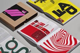
In a world saturated with visual content, capturing a reader’s attention has never been more challenging—or more important. Editorial design, whether for print or digital platforms, must do more than just inform; it must engage. One of the most effective ways to inject personality, energy, and uniqueness into an editorial layout is through the use of experimental fonts.
Experimental typography breaks conventional rules.
These fonts often defy symmetry, legibility, and even traditional form, but that’s exactly what makes them so compelling. When used thoughtfully, they can transform a layout from ordinary to unforgettable. Here’s how to make editorial layouts truly pop using experimental fonts.
Choose the Right Moment to Be Bold
Not every part of your editorial needs to scream for attention. Reserve experimental fonts for strategic placements—cover titles, section headers, pull quotes, or lead paragraphs. These are natural focal points where visual flair can be most impactful without overwhelming the entire spread.
Experimental fonts used sparingly become visual anchors. They guide the reader’s eyes and set the tone, whether it’s avant-garde, playful, rebellious, or futuristic. Pairing these bold choices with simpler, highly legible body fonts ensures that the content remains accessible.
Create Contrast Through Typography Hierarchy
One of the golden rules of design is contrast, and experimental fonts excel at delivering it. Use them to establish a clear hierarchy in your layout. A distorted, deconstructed headline juxtaposed against clean, minimal body text can create striking visual tension and excitement.
Think of the experimental font as the loud voice in the room—it should get attention, but not dominate the entire conversation. Balancing it with understated sans-serifs or classic serifs keeps the composition grounded and navigable.
Let the Font Influence the Layout
Sometimes, the font is the layout. Experimental typography often has a sculptural quality that can influence placement, flow, and composition. Allow the shapes, curves, and energy of the font to guide how text interacts with imagery or white space.
For example, if you’re using a typeface with exaggerated ascenders and descenders, consider a staggered layout that plays with alignment. If the font is dense and geometric, a grid-based layout can enhance its architectural feel. In other words, let the font breathe and become a structural element in the overall design.
Pair Intelligently
The biggest risk with experimental fonts is illegibility. A good workaround is to pair them with highly readable fonts that support and balance the overall tone. This ensures that while your layout has personality, it still communicates effectively.
Opt for neutral companions so the experimental font takes center stage. Don’t let conflicting type personalities clash; instead, aim for a complementary relationship, where one font does the heavy lifting while the other adds flair.
Think Beyond the Alphabet
Experimental typography isn’t just about letters. It’s also about visual expression. Some fonts are so stylized they function more like graphic elements than traditional type. Use this to your advantage by treating letters as textures, patterns, or illustrations. Oversized initials, layered typographic textures, or warped words can become visual metaphors, reinforcing editorial themes without saying a word.
Test Across Mediums
Always consider how your design will perform in its final format. What looks dynamic on a high-resolution print may fall flat on a mobile screen. Make sure the experimental font scales well, maintains legibility at key sizes, and doesn’t lose its impact in different media. Experimentation doesn’t have to mean compromise—it just means thoughtful application.
Conclusion
Editorial design thrives on storytelling, and experimental fonts can become characters in that story. When used strategically, they can evoke mood, draw attention, and give your layout a contemporary edge. The key lies in balance: letting your fonts push boundaries without breaking the reader’s experience. So go ahead—be bold, take risks, and let your editorial designs pop with typographic creativity.